mrspindlelegs
CEG'er
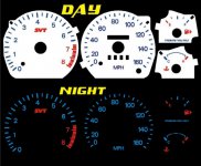
Looks like a lot of red on the gauges to me. Do we want all the red lines on the the tach (leaving the red line red marks of course) ? I think less red will make the SVT stand out more. I'm thinking just red lines on the actual numbers and not in between the numbers. Most of the other reverse glow gauges look to be this way
Also....is the 4 on the tach and the 80 on the speedo supposed to be centered? It looks like the the whole picture is rotated too far counter clockwise.
Not trying to be too nit picky but I tend to be a be that way with my cars
edit: n/m on the font. I checked the website and the font looks good....no fuzzyness.
I think you may be right about "too much red on the Speedo and the Tach". I went out and took a quick look at my VW Golf gauges (awesome gauge cluster color scheme) and there needs to be less red to match that. My suggestions are largely in line with yours:
Speedo: Make all blue
Tach: The SVT symbol and all marks starting at 6500 rpm and higher stay red. All else should be blue.
The gas gauge, temp gauge, headlight switch and climate control system panels look great.
I guess we should have Shaun do a second set of artwork based on teamSVTour and my suggestions (anyone else want to chip in?) to visually see a comparison. If not Shaun, somebody could do a photoshop on the images.
I could still live with the 1st draft if that was our only choice; it is still way better than the Factory color scheme.

