Thanks to Mikeyboy!!!!!!!!!!
Awesome Job
Very cool, definitly unique.
Looks ok...Not hateing so keeep your panties on..
I like it. can you get it in scratch and sniff

That's actually pretty cool. There's VERY few stickers I'd put on my car, but I'd put that one on there if it was relatively small and I had a legitimate reason to do so.
Two things I feel wrong about that second image:
- skunk needs less blurry
- border along the words should continue closer to the picture, particularly along the bottom. Right now it "squares off" the picture and makes it feel disconnected.
But I like that logo a lot!!
Now if it would just fit the sail panels.....Awesome !!!
Very cool, now when do we add the auto detailing wing there


Originally posted by 98 SE:
Two things I feel wrong about that second image:
- skunk needs less blurry
- border along the words should continue closer to the picture, particularly along the bottom. Right now it "squares off" the picture and makes it feel disconnected.
But I like that logo a lot!!
ding ding ding!
werd.
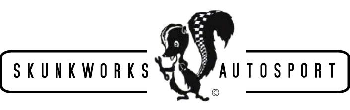
That image we used for the Skunk is a Lockheed martin modified logo. And when you zoom in on it it becomes super blurry.
Im thinkin about the Sail Panel thing, Could be HOT!
Tell Mike he needs to stop being lazy and redraw the logo.
I mean come on, what are you going to do with a logo thats about 120 pixels tall. Not much application for that. Vector that stinky google image.
IMO the skunk looks good, although resolution needs to be improved. I would have though that he would have drawn it in either illustrator or by hand, and then scanned it in at a decent res. but it doesnt even match the resolution on the rest of the logo. The rest of the logo looks like an afterthought. Not trying to knock the design but those changes should probubly be made before the big marketing rollout happens...
Where is this skunkworks place at?
Maybe if you would show up to meets when your invited or went riding with me you would know!!!
LOL if you really wanna know shoot me a PM
What is this riding thing you speak of

now that my shoulder is fixed I will be able to ride this year...but honestly I only rode 4 times last year.....once in W Va and that almost got ugly because my shoulder dislocated in the mountains.....not fun....anyway..I will hit you in the head with a PM....
Looks pretty good....redraw the logo bigger and you are golden.
you should add "we stink" at the bottom of the logo
Originally posted by svt4stv:
you should add "we stink" at the bottom of the logo
Hmm ya probably not...
New Redrawn logo should be done tonight
This item needs to be at SZ06'
I think I prefered a happy skunk. Less likely to stink up my car.
So where is this place at?
what happened to Skunkworks Air Marshall Service?

Got shot full of holes.
Originally posted by svt4stv:
what happened to Skunkworks Air Marshall Service?
You get a Score based on a few area's then your name goes on a list like every other Government job.
Soo i could get called today or 3 years or never.
The worst part is they don't tell you what # on the list you are.

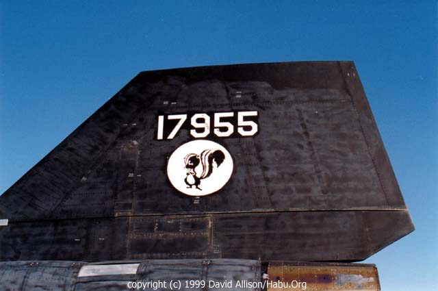
Nice logo, but I like the all black look.
Ohh wow!!!!
Whats everyone else think?
Bad. Why not somehow translate the stripe of a skunk into this horizantal element? That could be a bad idea also. But I do think the skunk gets lost in the black box. And whats the application? Is the text always going to be surrounding the skunk when the logo is used?
There will be the Skunk Alone and then the logo with the words and such.
i do see how it can get lost though
the black one is awesome. remember,
skunkworks, SR71.... black black black
what about carrying the checkered flag theme onto the white stripe on his head.
Originally posted by svt4stv:
the black one is awesome. remember, skunkworks, SR71.... black black black
No way really?
How about Have Blue?
You guys need to get hood ornaments made too.

This is more representative of the shop though.

Originally posted by UPSTART-SVT:
Nice logo, but I like the all black look.
In a picture, I'd say the black one looks better. In a decal though I'd say the other one looks better.
Originally posted by todras:
This is more representative of the shop though.
coming from you that means SOOO much
really guys, i can sit here and make a million different variations of the logo given the time. as steeda and barge can tell you i exhaust every possiblility when given an assignment. i have easily 50 hand drawn sketches of the skunk logo and type and at least 25 different variations of the logo on the computer. this design was to be used for shirts, stickers, etc. the black one would be way too heavy for a stitched logo for a shirt and would come out horrible. in fact the checks near the base of the tail are probably going to be too small. when you spend time in a pursuit you find out what you can and cant do.
sounds like excuses

steeda, i suggest you find a different vendor

I'm Very happy with the Product Mikeyboy has supplied!!!!!
Originally posted by svt4stv:
sounds like a no talent wannabe. 
i dont have any talents

The word "SKUNKWORKS" is easier to read in the Mikey logo. Something about the font and inverse fool the eyes a bit near the KW. Cost is key and you want an image that works in B&W. This will easily be accomplished. Is there a 2c or 4c in the plan? As for embroidery, newer machines are capable of some very high resolution (threads per inch). In screen printing, you'll be ok with the logo at it's current size.
Show us 2c! Without italics.
Originally posted by svt4stv:
i dont have any talents
everyone has some sort of talent. you can weld.
Originally posted by sigma:
Originally posted by UPSTART-SVT:
Nice logo, but I like the all black look.
In a picture, I'd say the black one looks better. In a decal though I'd say the other one looks better.
I like the outline logo better too. Looks cleaner.
If you like the white letters on black, try splitting the banner instead of running it behind the skunk, and have the skunk in the middle by himself. That'll pull that part of the logo out more & you'll still get the banner effect.
And slap a couple of walnuts under that bugger. He's lookin' a bit girly...
Originally posted by Mikey Boy:
Originally posted by svt4stv:
i dont have any talents
everyone has some sort of talent. you can weld.
im not the one doing the welding.  (isnt that a skill?)
is cutting steel with a saw a talent? how about packaging/shipping?
Why not have the text wrap around the skunk in the shape of a circle?